Exercise 2: Critiquing "art.yale.edu"
Objective: Making Subjective & Objective critiques about the web site http://art.yale.edu, using artistic terminology.
Home page - Art.Yale.Edu
The Moment I visited the website, I somehow felt that they didn't update their website since year 2000. Frankly, the website is updated in a daily bases, even the home page thumbnail image above is different from what it's now. Yeah it's kind of wired that a well-known art website for Yale University is neglecting and throwing aside all the rules of legibility and usability away. Well, aside from that absurd and irrational layout, I do really think that there's a concept relaying between the lines. Implemented or rescaled on different perspectives.
We do all agree aesthetically that the website didn't even meet the minimum requirement to be at least visually pleasureful. But, putting into consideration that a flawless design doesn’t necessarily should indicate an effective design. For example; the Dadaist art practices opened indeed many gates to different art forms & conceptual potentials, while firstly it was harshly rejected by many well-known artists. I know relating the website to a movement sounds vague, but actually the website also could be following the same ideological & speculative approach.
Constant Header
Constant Navigation menu
Constant Footer
The website carries many pros and cons that need to be pointed out. What the website emphasized the most is the visual communications atmosphere; Having a tiled background could influence a day event or a mood expressed. On the other hand, graphically wise, it's creating a disturbing graphic interface which create some confusion & attention disturb. As a result, barely the eye can rest on the content. Also, having the numerous amount of links, highlighted text, text boxes and scrolls are scattered vertically in the page create a sense of maze or codes to analyze. Despite everything, the hierarchy of the website is working; The Menu is constant through navigating in which influence an escape from all the madness. While the header is disentangled from any style, and have the footer look alike characteristic.
In conclusion, as I mentioned in the introduction; I do really feel that this website is intentionally made with such characteristic & layout; laying under the dadaist atmosphere. They redefine a nice approach in the web design field indeed. Critiquing such a clever work is a pleasurably experience, enhancing and feeding my brain with the purposes and needs of such an ideas, concepts and how it's applied.
Postmodernism Movement is what this essay will stand for. A discussion of how this movement started, rolled and its main characteristics; showing also the impact of Postmodernism on Graphic Design Communications. In 1970s; End of twentieth century Modern Art started to fade and die away, taking down with it all the ideologies and rules that was set back then. (Eskilson, 2007, p.336)
Postmodernism rejected the modernism symmetrical and international style. Thats why fairly Postmodernism term means "after modern art." (Eskilson, 2007, p.336) besides, Postmodernism distinct by mixing different mediums, types, weights and sizes. While also, many methods were approached in playfully and unexpectedly style under the idea of disorganized objectivity. (Meggs, 2006, p.468; Poynor, 2003, 149) Unlike, the strict rules that modern style carried.
The notion of postmodernism became the general currency among all the world cultures (hopkins, 2000, p.197), In which the main thrust of this movement includes the messiness of placed elements, overprinting, cluttered pages, blurred photographs. (Eskilson, 2007, p.336; Meggs, 2006, p.468) Many Designers were interested in using these aspects bending the traditions that modernism carried and express their ideas and the way of communication to the viewer upon cool clarity. (Meggs, 2006, p.469; Frascina and Harris, 1992, p.97)
Europe and America are considered to be the heart of this movement. (Eskilson, 2007, p.336 p.338; Meggs, 2006, p.467) For instance, Psychedelic drugs, LSD played an important role, in which resulted a visual and auditory hallucinations referred as dream trip, considered as method of thinking enlightening. (Eskilson, 2007, p.338)
Many artists adopted this fashionable trend in order to appeal the young viewers and a good kind of advertisement. In the Youngbloods poster, many sophisticated techniques is used such as photo collage; Showing a couples dancing integrating letters in the form, giving the impression of vigorously and dynamically. While the word "Avalon Ballroom" seems to expand and flowing off the poster. (Eskilson, 2007, p.338) And this confirms the sense of unreality, dreamy image making the viewer to throw questions and curiosity look.
Type design follows also the postmodernist phases; like other designers, type designers have also felt the need of finding a new inspiration among the traditional ideas. Type is a design universe unto itself, an essential dimension in the history of art and design. Designers emphasizing the important of the word, going wild and revolutionary. (Meggs, 2006, p.471) Lifting aside the metal cases to the photographic, handwritten and collage medium techniques. Giving each letter a story and journey to be told.( Meggs, 2006, p.472)
Barbara Kruger, Untitled (Your Body is a Battleground)
On the other hand, Designers quickly developed languages from the this movement creating their own signatures in a very effective way (Eskilson, 2007, p.370). The Technology was rapidly growing, in which the postmodern graphics shows further and wide impact in the viewer.Barbara Kruger shows a powerful message concerning women’s rights through her artwork. (Eskilson, 2007, p.371) In much of her work, she uses bold, imagery along with text that is laid over blocks of vivid red color to catch the viewer’s eye to evoke a concern over a particular topic. (Eskilson, 2007, p.370)
In conclusion, Postmodernism movement established a totally affective approaches in how to carry the ideas to the viewers. Thou it rejected all what modernism had. By rejecting the international rules, restricted designers found themselves in the doors of unleashing their creativity ahead, allowing them to use a wide variety of visual methods to communicate their messages.
Bibliography:
- Eskilson, S. (2007). Graphic design: a new history. New Haven; Yale University Press.
- Meggs, P. Purvis, A. (2006). Meggs History of Graphic Design. New Jeresy; John Wiley & Sons.Inc.
- Poynor, R. (2003). No More Rules: Graphic Design and Postmodernism.New Haven: Yale University Press.
- Hopkins, D.(2000). After Modern Art: 1945-2000. United Kingdom: Oxford University Press.
- Frascina, F., Harris, J.(1992). Art in modern culture: an anthology of critical texts. London: Phaidon Press Limited.
- Your Body is a Battleground (2008). Retrieved on April 28, 2011, from
The German PoetHugo Ball one of the founders of ZurichDada in February 1916, gathered at Cabaret Voltaire to come out their creativity to protest against the war. It was characterized by the irony, satire, and improvisation in their performances and work. In which, Dada exemplify iconoclastic spirit. (Eskilson, 2007, pp. 135) Zurich Dada "anti-artistic" made events at the Cabaret Voltaire; these events were principally directed against Western art.
German Dada follows the rule of, never follow any known rule. Dada movement itself influenced by Abstraction, Expressionism and cubism; nevertheless, there was no predominant medium in Dadaist art works; It was a creation from various materials such as glass, plaster, wooden reliefs, assemblage, collage, photo-montage and the use of ready made objects. Dada movement was directly responsible for Surrealism.
First International Dada Fair, Berlin, June 1920. From left to right:
Raoul Hausmann, Hannah Hoch, Dr.Burchard, Johannes Baader,
Wieland Herzfelde, Mrs. Herzfelde, Otto Schmalhausen, George Grosz,
John Heartfield
Raoul Hausmann was one of the young people who stand against the war and was the core of Berlin Dadaist. (Dickermen, 2006, pp. 87) In April 12th, 1918 Hausmann, Huelsenbeck, George Grosz, John Heartfield, Jung, Höch, Walter Mehring and Baaderstarted the Club Dada in which it show more serious political commitment.
Hausmann used the photo-montage and collage technique extensively in his work, also; he organized the first International Dada Fair featuring almost 200 works by Dadaist artists.(Eskilson, 2007, pp. 140)
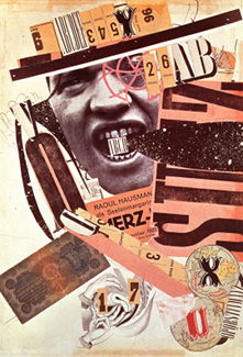
Raoul Hausmannbecame the most important publisher of German Dada writer when he started the journal Der Dad in 1919. This work shows some of collage, free typography and limited color palette. In this poster he represent his portrait with some random objects over one large sheet, trying to emphasize some aggressive challenge.(Eskilson, 2007, pp. 141)
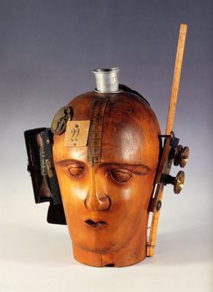
Mechanical Head [The Spirit of Our Age],
assemblage circa 1920
This time Hausmann tries to permit new material in painting to show vigor, In addition to this, fixing the spirit of every object to their basic formation and state (Foster, 2004, pp. 138) He tried to emphasize that object itself can interact with the surroundings. Moreover, his intention was for extending his practice into three dimensional space, also; to deliver his ironic stance to those bourgeois material and mediums concerns.(Gale, 1997,pp.135)
(Optophnetic poem ) Phonemes“kp’erioum” (1919)
Hausmann continues experimenting using printed poem letters and playing with it creatively, the elements of typography varies in terms of different sizes and thicknesses even typeface; Giving the indication of the musical notation, Therefore, this work often called "The science of visible speech sounds"(Richter, 2001, pp. 121) He reflect the continuous development, it was the most effective and original art for the Dada's.(Gale, 1997,pp.125)
Hausmann was a complete genius, this is one example of his onomatopoeia poems (1946 Recording), at the first of the clip; Giving a small brief on his acoustical poem, then Hausmann is being introduced at ( 0:30s) .
A remake animationofCabaretVoltaire,which shows someDadaistsand a phoneticpoem is heard. In which the used character is HugoBall dress and thepoem by RaoulHausmann.
ABCD (Self-portrait) A photomontage
from 1923-24
The artist tries to make the material exposed reflecting simple reality, perhaps with new realities by combining photo with words ( collage ), (Gale, 1997,pp.131) Making it condensed and rich photo-montagecollage. The artist portraits emphasis the organic and vital signs of an reality artwork. Nevertheless, having well distribution composition and warm color palette insure that the poster carries value message.
Raoul Hausmann, 1920 " Tatiln At Home "
Collage of pasted papers and gouache,
National Museum, Stockholm
Hausmann made a photo montage showing the a half-blooded combination of man and machine (Eskilson, 2007, pp. 224) in which the brain is made up of industrial parts and objects, emphasizing the vision of an engineer. Hausmann stated that this photo montage was an almost random process. (Eskilson, 2007, pp. 224) Furthermore, the Dada and the Constructivist have many concepts in parallel such as using abstraction to communicate ideas in order to convey their beliefs; The term photo montage means " Photo assemblers " originated in Berlin Dada.
In fact who wanted to make a work, it should have a relation with the society, and have a strategy to represent the modern world in a novel world without using the conventional Realistic painting techniques.(Eskilson, 2007, pp. 224)
KurtS. Figure1
Kurt Scwitters entered the German Dada movement early 1919 when everything was already identified in term of thematic and style properties, especially the nonsense and playfulness characteristic.(Dickermen, 2006, pp. 157) Scwitters was the one who introduced Dada in Hannover, embraced collage and developed his famous collage work Merzart with new approaches. He was an important project collaborator, such as his Dada/ Merz performance tours with Raoul Hausmann. (Dickermen, 2006, pp. 157) Schwitters worked in several movements inlcuding Dada, Constructivism; Also, poetry and typography. (Gale, 1997,pp.131)
This animated work is for Kurt Schwitters " Ursonate", In which it's a reference to a musical composition. Schwitters's main play is a composition that balances between music and language, while at the same time forming a unique visual work as seen in KurtS. figure 1. Schwitters had got many sound poetry .
Kurt Schwitters, " Das Undbild " ( The And Picture ) 1919
Schwitters work shows his collage process contains a variety of material, it's an assemblage of gouch, papers, board, wood, metal, leather, cork, and wire gathering on paper. In addition, he used a large modern non-serif type; Also, using the diverse parts together to make it a big assemblage painting. All in all, to explore its conceptual implications in a more complicated and formal way.(Dickermen, 2006, pp. 163)
This video will shows us why Schwitters collage is uniqe.
Kurt Schwitters Interior of Merzbau, Hannover,1923
The Merzbau is one of the ultimate Dada monument art piece. Starting in 1923, Schwitters began converting rooms in his house in Hanover, into architectural works of art. As the project expanded it began to look literally Cubism, his work was full of contradictions.(Gale, 1997,pp.163) Schwitter method of working expressed the destruction and construction expressed through process and collage in its broadest understanding.(Dickermen, 2006, pp. 173)
Theo Van Does Burg and Kurt Hausmann
"Small Dada Evening" 1922
In 1922, Van Does Burg with the contribute of the Dadaist Kurt Schwitters make poster of Kleine Dada Soirée "Small Dada Evening"(Eskilson, 2007, 194). The poster shows clearly Dada as chaos element, mixed type of fonts with different scales and weights(Eskilson, 2007, 195); Nevertheless, it shows asymmetrical balanced layouts and color is used as an essential structural element.(Gale, 1997,pp.162) So, De Stijl and Dada was considered opposite but complementary movements, it's signified a revolution. (Meegs, 2006, 303)
In Conclusion, Dada was melding into surrealism, this movement was unstable and became less active. Because artists started to explore another movements such as surrealism, social realism and other forms of modernism. Dada started to fade by1924 in Paris.
________________________________
Bibliography:
- Eskilson, S. (2007). Graphic design: a new history. New Haven: Yale University Press.
- Gale, M. (1997). Dada & Surrealism. Phaidon Press.
- Dickermen, L. (2006) DADA. New York: D.A.P
- Meggs, P. Purvis, A. (2006). Meggs History of Graphic Design. New Jeresy: John Wiley & Sons.Inc.
- Foster S. C. (1985). Dada / Dimensions . London: U.M.I Research Press.